Basic design principles to keep in mind
Now that we’ve defined our visual identity and we already have photographs, we can start thinking about how all these elements work together when creating a graphic piece.
To do that, it’s important to consider a few basic design principles. Here they are:
Hierarchy and contrast
As we mentioned before, the key is to organise and prioritise elements, this is the information hierarchy. For every piece you create, you must think about the reading order and which elements you want to highlight.
If you want to highlight the candidate’s name and official photo, make sure there aren’t other distracting elements competing for attention. Also, be careful not to cover the candidate’s photo entirely. It’s essential that both the photo and the name are clear and easy to see.
If you’re working on a piece that includes text, think carefully about contrast and white (empty) space. Contrary to common sense, a larger size doesn’t always guarantee readability. The empty space you leave is just as important as the size of the photo or text.
When there’s text, it’s crucial that it’s readable and that the photography doesn’t distract from or confuse the message.
Now let’s think about contrast. Contrast is created by using opposing elements. A typeface with heavy, thick strokes combined with another that’s lighter and thinner creates contrast. A saturated colour paired with a neutral tone does the same. On the other hand, a photo with too many colours can make it harder for text to stand out.
If you’re unsure about text placement or readability, a good rule of thumb is to place the text inside a coloured block. This almost always improves contrast and legibility.
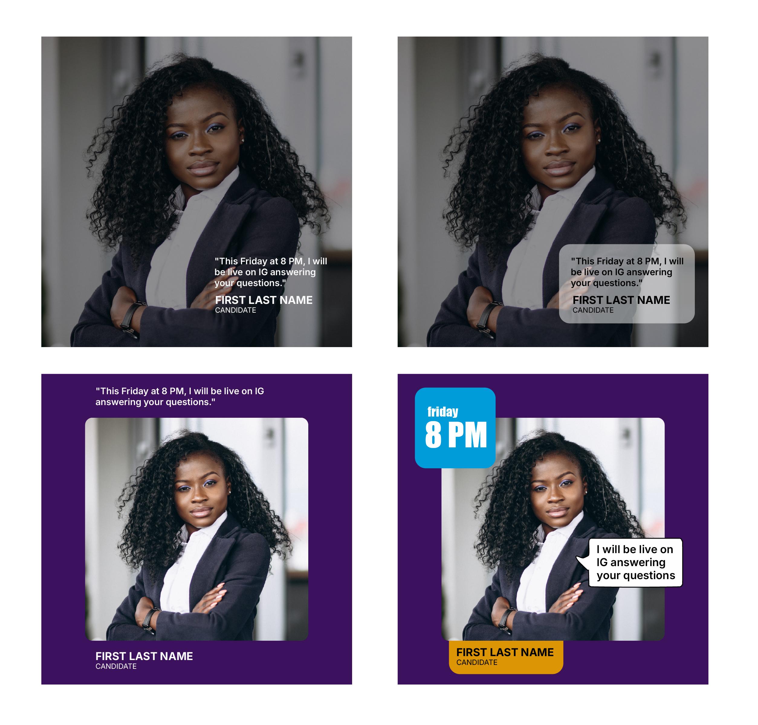
In the first two examples, readability is compromised. In the third one it improves, but in the fourth the placement of elements and the use of colour blocks end up organising the information much more effectively.
On social media, it’s usually more effective to work with very little text. Instagram and Facebook even have limitations on how much text should appear within an image. If you want people to read your content, it’s important to be concise and straight to the point. You can always expand on the message by using the supporting text (copy) below the image.
Alignment
When it comes to text alignment, here are a few quick suggestions:
When working with a block of text (whether short or long) left alignment is generally the best choice. It’s the most common option because it’s clearer, more readable, and visually more organised.
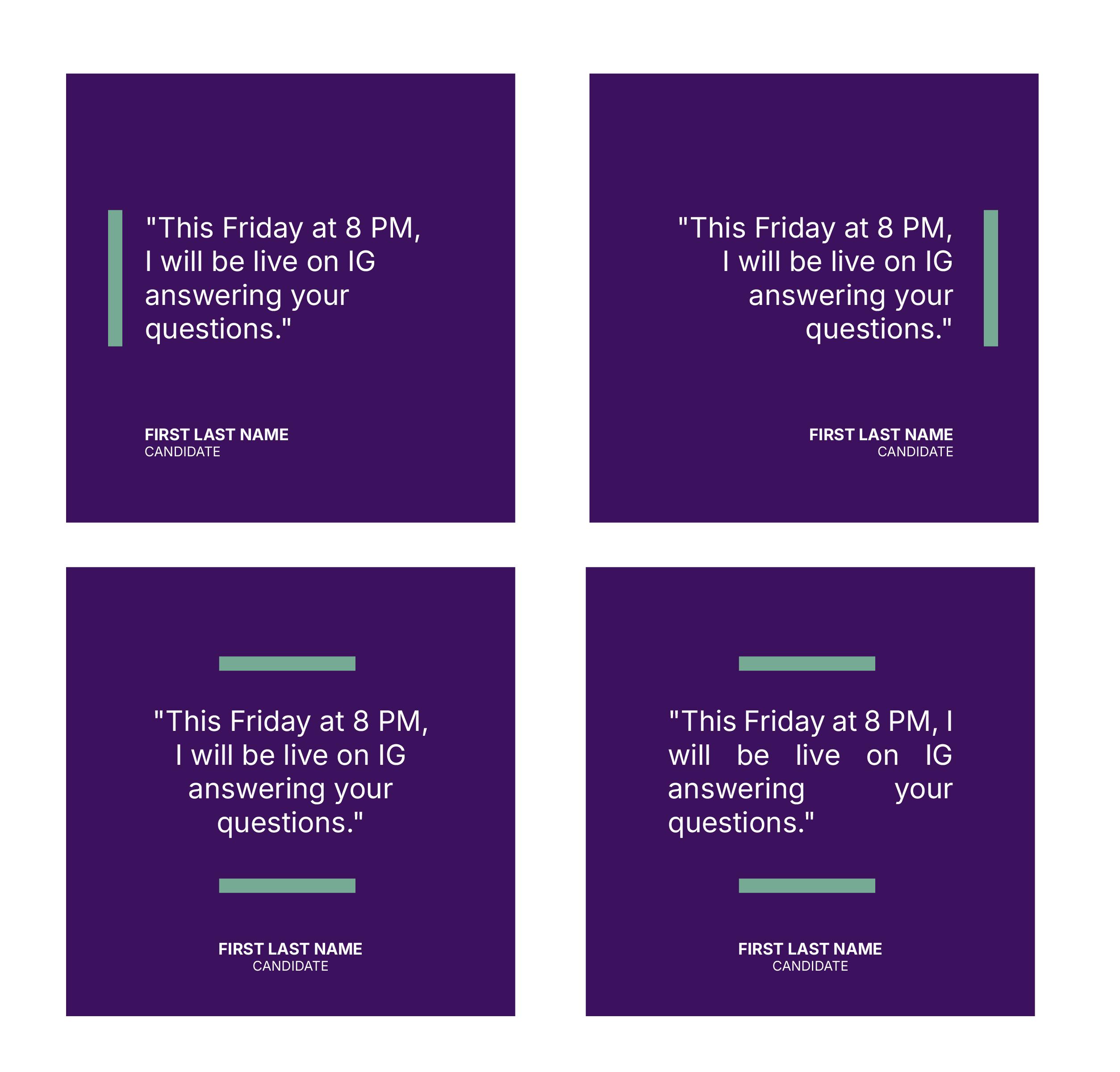
Right alignment is used for short texts, generally when we have two bodies of text for more aesthetic purposes, to play with variables. Do not use it for large blocks of text, as it hinders smooth reading.
Center alignment provides balance and a formal appearance, but it is not suitable for long texts.
Finally, justified alignment is only legible if used correctly and there are no spaces between words or letters that interrupt reading.
Composition
Try to think of the piece with all its elements arranged harmoniously and with visual balance. Remember that emptiness is a powerful element.
If you have one element with greater visual weight, whether due to size or color, try to balance that weight with the rest of the pieces, avoiding an unbalanced effect in any one area of the piece.
